yTable
Description
The yTable component serves as a powerful tool primarily designed for displaying and interacting with an entity. It's an adaptable element that allows both static and dynamic content.
With the yTable you can display tables of any kind and data from any entity of your liking.
Some uses for the yTable are:
Basic Structure
The basic structure of the yTable shall be explained in the following. For the general structure of a yComponent please visit the YBase-components basic-structure.
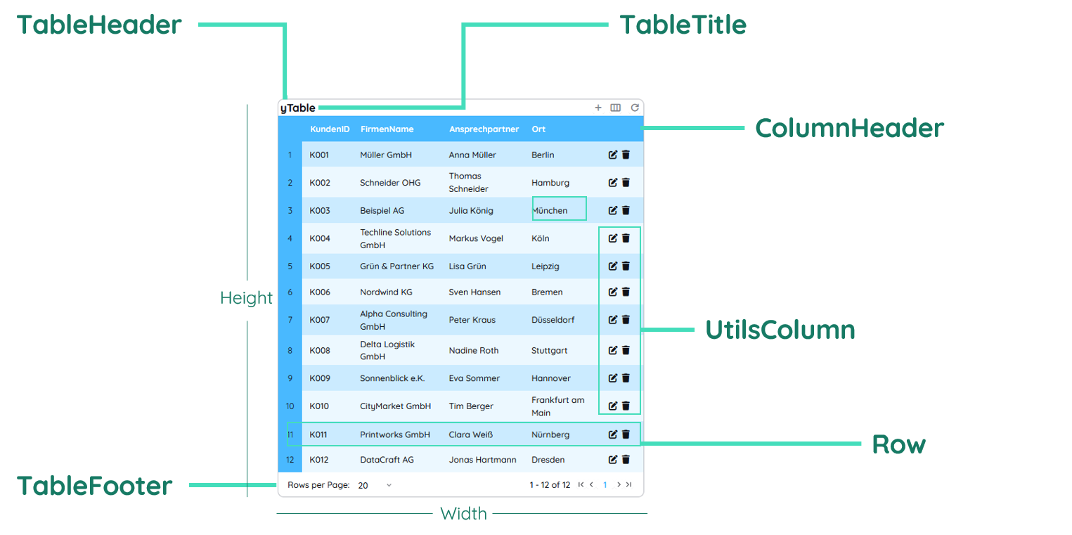
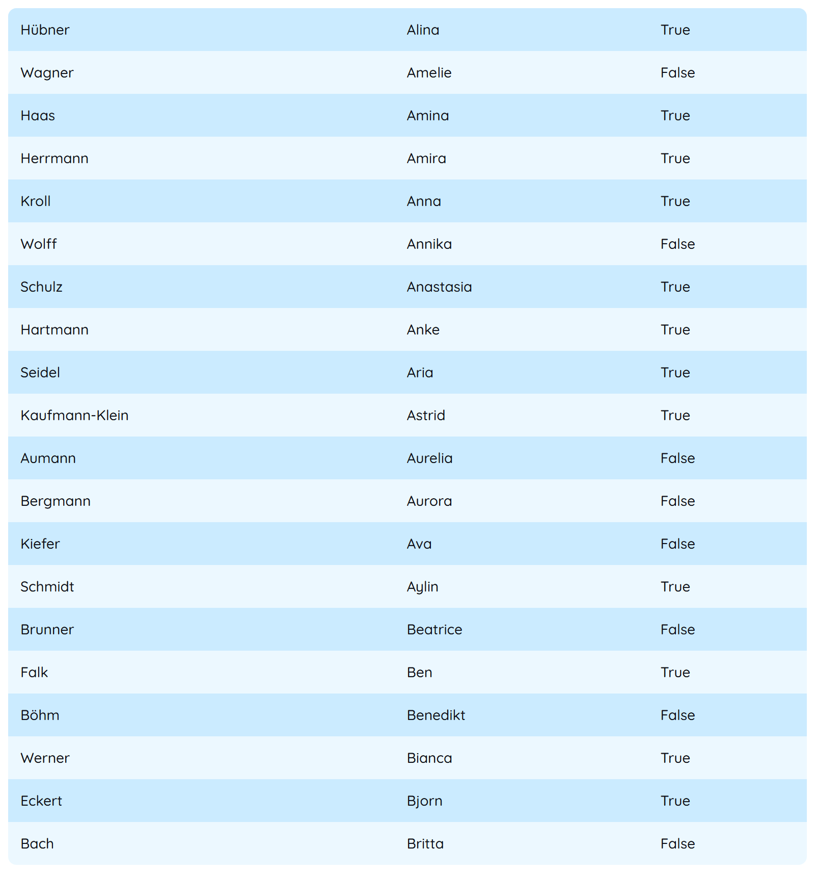
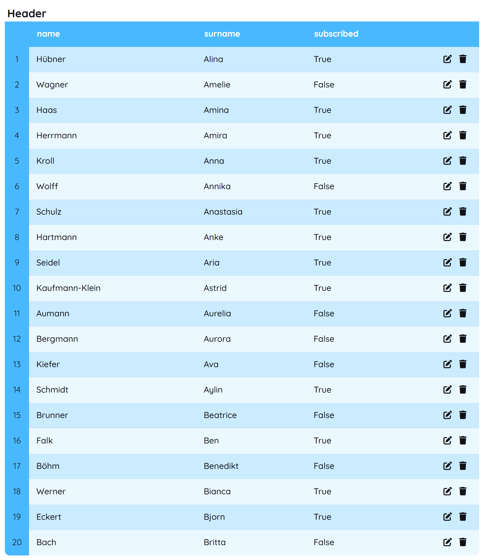
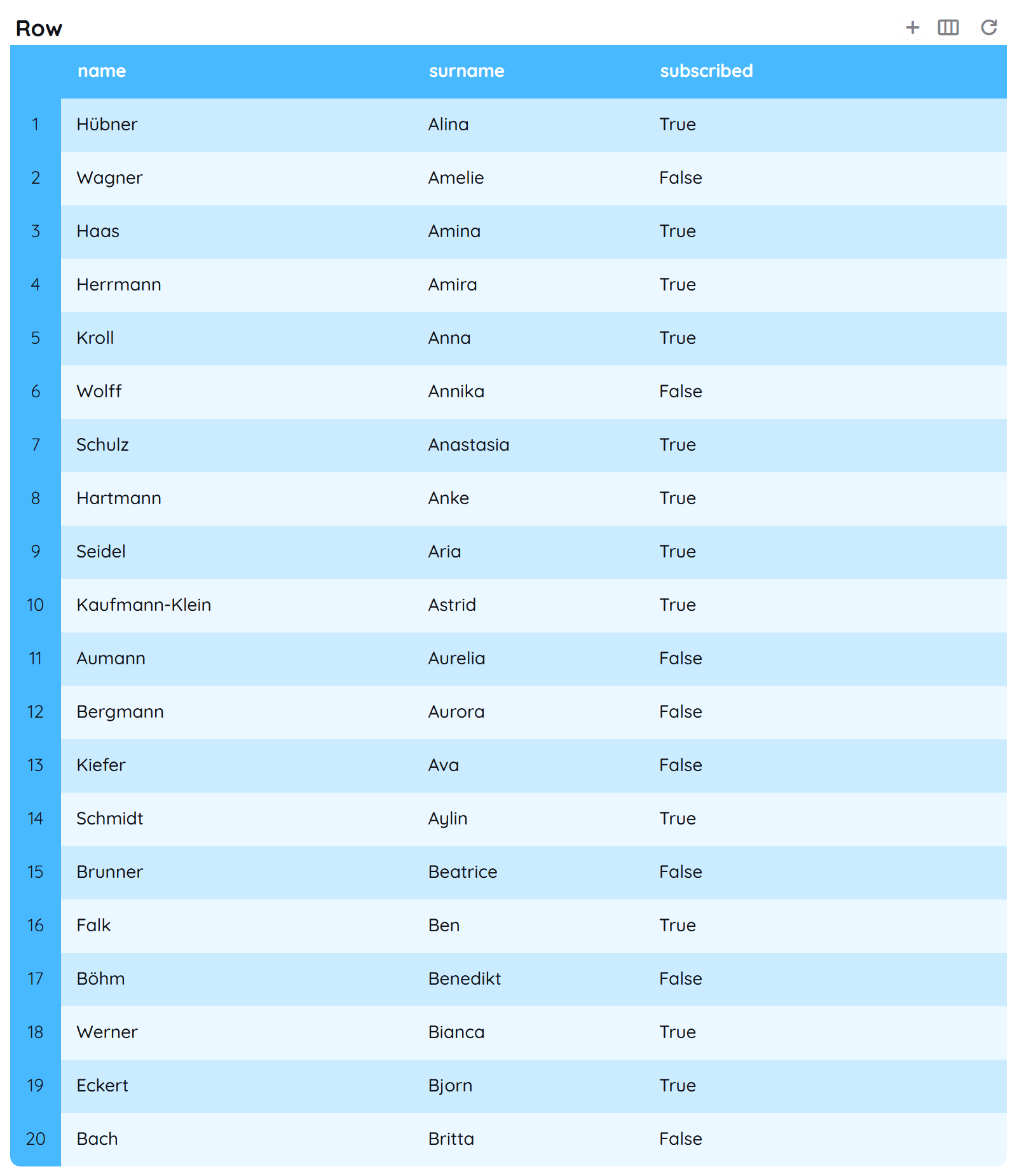
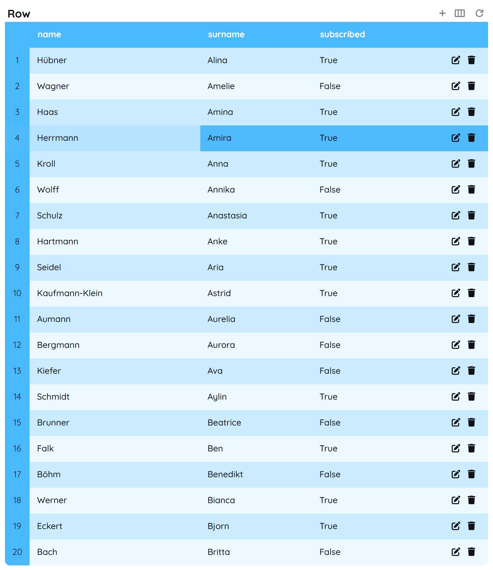
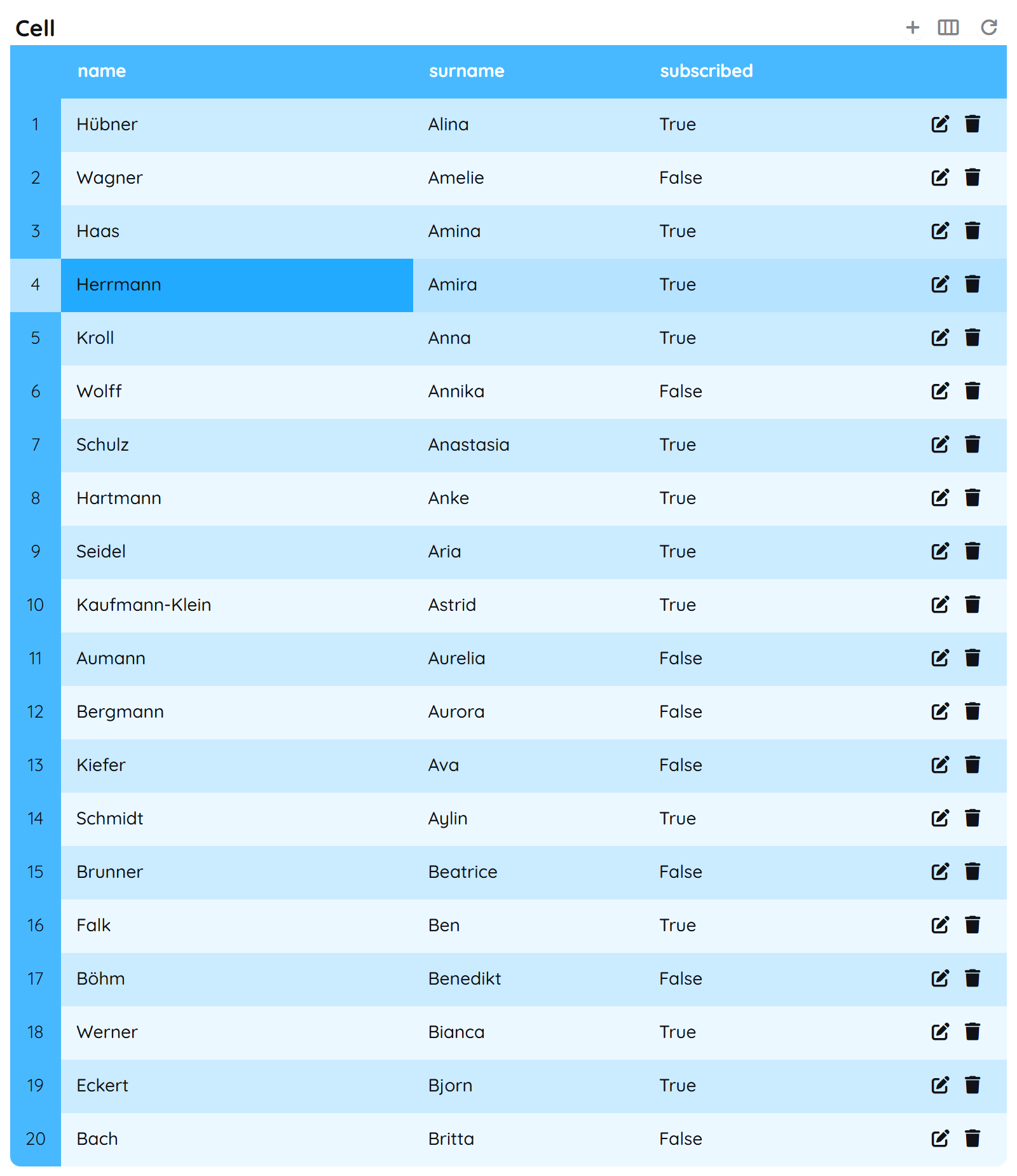
The yTable as seen above contains a header, columns, rows and a footer.
Header
The header contains the title of the table and toggleable functions for adding rows or filtering columns. It is normally visible, but can also be toggled, like the elements inside the header. You can find further explanation at the TableHeader Property and TableHeader Title.
Columns
The columns consist of many sub-components. ColumnHeader, CounterColumn and UtilsColumn together form the columns. All three of them are normally visible but can be made invisible. The CounterColumn contains a counter to show the actual index of a row. The UtilsColumn allows you to have edit options for any row. The ColumnHeader renders the existing properties of an entity as columns.
Rows
The rows are the actual data entries of an entity and present this data visually. You can find further explanation at the Row Property.
Footer
Finally the TableFooter contains any options for pagination. It is normally visible, but can be toggled if needed. You can find further explanation at the TableFooter Property.
Properties
Through its various properties the yTable can be configured to suit your needs. The display below provides you with an overview of all the yTable properties.
Properties can be changed directly through three methods:
- Inside the Toolbar, which is positioned in your workarea next to your component right where you need it. It shows the most important properties, thus providing a fast and efficient way to configure your component in the most basic way.
- It may also occur in the Toolbar Extension, which is a seamless extension accesible as a dropdown item of the Toolbar. It extends the functionality of the Toolbar by providing advanced pickers for the most used properties.
- Inside the Detail Panel, which is located in the righthand drawer. Every property of a component can be configured here.
- Generic
- Style
- Table
- Links
- Events
- Columns
METAread more
The identifier of the component that is unique within a page.
The type of the component. For this component it is -table.
The custom name of the component. It serves for better identification of the component.
The custom version of the Table-component. This can be used to ensure that all components work well together.
The CoreTheme, which will be apllied to the Table. For further information on themes visit the themes page.
The subtheme subordinated to the previously specified CoreTheme, which will be apllied to the Table. For further information on themes visit the themes page.
The group theme is a further variation of the subtheme which is specified especially for variations of a component inside the subtheme. For further information on themes visit the Theme-Manager page.
DISPLAYread more
This property specifies the display behavior of the component. This can be be set to:
- none
- block
- flex
- inline
This property specifies the type of positioning method used for the component. This can be be set to:
- static
- relative
- absolute
- sticky
- fixed
This property can toggle the visibility of the component. The two modes are completely hidden and fully shown.
SIZEread more
The minimum value for the width of the component. This can be set in:
- px
- pt
- em
- vw
- vh
- %
The minimum value for the height of the component. This can be set in:
- px
- pt
- em
- vw
- vh
- %
The value for the width of the component. This can be set in:
- px
- pt
- em
- vw
- vh
- %
- auto
The value for the height of the component. This can be set in:
- px
- pt
- em
- vw
- vh
- %
- auto
The maximum value for the width of the component. This can be set in:
- px
- pt
- em
- vw
- vh
- %
- none
The maximum value for the height of the component. This can be set in:
- px
- pt
- em
- vw
- vh
- %
- none
The flex property sets the length on flexible items. This sets the value in n-fold shares extrapolated to all other components with the flex display within the same container.
PLACEMENTread more
This property creates a space around the component, outside of the top border. This can be set in percent or pixels.
This property creates a space around the component, outside of the right border. This can be set in percent or pixels.
This property creates a space around the component, outside of the bottom border. This can be set in percent or pixels.
This property creates a space around the component, outside of the left border. This can be set in percent or pixels.
This property creates a space within the component, inside of the top border. This can be set in percent or pixels.
This property creates a space within the component, inside of the right border. This can be set in percent or pixels.
This property creates a space within the component, inside of the bottom border. This can be set in percent or pixels.
This property creates a space within the component, inside of the top border. This can be set in percent or pixels.
BACKGROUNDread more
The color of the background. This can be set as a color from a palette or a custom hex color.
BORDERread more
The color of the top border. This can be set as a color from a palette or a custom hex color.
The style of the top border. This can be be set to:
- solid
- dotted
- dashed
- none
The width of the top border. This can be set in percent or pixels.
The color of the right border. This can be set as a color from a palette or a custom hex color.
The style of the right border. This can be be set to:
- solid
- dotted
- dashed
- none
The width of the right border. This can be set in percent or pixels.
The color of the bottom border. This can be set as a color from a palette or a custom hex color.
The style of the bottom border. This can be be set to:
- solid
- dotted
- dashed
- none
The width of the bottom border. This can be set in percent or pixels.
The color of the left border. This can be set as a color from a palette or a custom hex color.
The style of the left border. This can be be set to:
- solid
- dotted
- dashed
- none
The width of the left border. This can be set in percent or pixels.
The radius of the corners of all the borders. This can be set in percent or pixels.
The collapsible sets whether cells inside a
have shared or separate bordersSHADOWread more
The shadow of the component. This is set by the 4 sub-properties x, y, blur and spread of the shadow-property, which can be further read about in the shadow-property section.
OPACITYread more
The opacity of all colored parts of the component. This value is set in percent.
ALIGNMENTread more
This property specifies, whether the scrollbar should be displayed or not, while keeping scrollability.
TABLEHEADERread more
This property specifies if the table-header should be visible.
The color of the table-header background. This can be set as a color from a palette or a custom hex color.
The color of the icon inside the table-header for the normal state. This can be set as a color from a palette or a custom hex color.
The color of the icon inside the table-header for the hover state. This can be set as a color from a palette or a custom hex color.
The color of the icon inside the table-header for the active state. This can be set as a color from a palette or a custom hex color.
This property specifies if an addRecord-button should be added to the Table.
This property specifies which columns should be visible.
This refreshs the tableHeader.
This property specifies if the SourceLink-reset-button should be hidden.
This adds a record to the table-header.
This specifies if the add-record-button should be displayed left or right.
This property creates a space within the table-header, inside of the top border. This can be set in percent or pixels.
This property creates a space within the table-header, inside of the right border. This can be set in percent or pixels.
This property creates a space within the table-header, inside of the bottom border. This can be set in percent or pixels.
This property creates a space within the table-header, inside of the left border. This can be set in percent or pixels.
TABLETITLEread more
The color of the table-title text. This can be set as a color from a palette or a custom hex color.
The font-family of the table-title text. This can be picked from a large list of provided fonts.
The font-weight of the table-title text. This can be set in a custom number, as example:
- 400 = normal(regular)
- 500 = medium
- 600 = semi bold
- 700 = bold
The font-style of the table-title text. This can be set to normal, italic or oblique.
The text-transformation of the table title text. This can be set to:
- capitalize
- uppercase
- lowercase
- none
- full-width
The text-decoration of the table-title text. This can be set to:
- strikethrough
- underline
The font-size of the table-title text. This can be set in: -cm
- mm
- in
- px
- em
- ex
- ch
- rem
The font-align of the table-title text. This property moves the table-title text to the desired position, it can be set to left, center or right.
The title of the table.
COLUMNHEADERread more
This property specifies if the column-header should be visible.
This property specifies if the column-header should be selectable.
This property specifies if the column-header should be resizable.
The color of the column-header background. This can be set as a color from a palette or a custom hex color.
The opacity of the background of the columnd header. This value is set in percent.
The color of the column-header text. This can be set as a color from a palette or a custom hex color.
The font-family of the column-header text. This can be picked from a large list of provided fonts.
The font-weight of the column-header text. This can be set in a custom number, as example:
- 400 = normal(regular)
- 500 = medium
- 600 = semi bold
- 700 = bold
The font-style of the column-header text. This can be set to normal, italic or oblique.
The text-transformation of the column header text. This can be set to:
- capitalize
- uppercase
- lowercase
- none
- full-width
The text-decoration of the column-header text. This can be set to:
- strikethrough
- underline
The font-size of the column-header text. This can be set in: -cm
- mm
- in
- px
- em
- ex
- ch
- rem
The horizontal font-align of the column-header text. This property moves the column-header text horizontally to the desired position, it can be set to left, center or right.
The vertical font-align of the column-header text. This property moves the column-header text vertically to the desired position, it can be set to left, center or right.
The height of the column header. This can be set in:
- px
- pt
- em
- vw
- vh
- %
- auto
BODYCELLread more
The color of the table-body-cell background. This can be set as a color from a palette or a custom hex color.
The opacity of the background of the table body cell. This value is set in percent.
The color of the table-body-cell text. This can be set as a color from a palette or a custom hex color.
The font-family of the table-body-cell text. This can be picked from a large list of provided fonts.
The font-weight of the table-body-cell text. This can be set in a custom number, as example:
- 400 = normal(regular)
- 500 = medium
- 600 = semi bold
- 700 = bold
The font-style of the table-body-cell text. This can be set to normal, italic or oblique.
The text-transformation of the table body cell text. This can be set to:
- capitalize
- uppercase
- lowercase
- none
- full-width
The font-size of the table-body-cell text. This can be set in: -cm
- mm
- in
- px
- em
- ex
- ch
- rem
The horizontal font-align of the table-body-cell text. This property moves the table-body-cell text horizontally to the desired position, it can be set to left, center or right.
The vertical font-align of the table-body-cell text. This property moves the table-body-cell text vertically to the desired position, it can be set to left, center or right.
This property creates a space within the table-body-cell, inside of the top border. This can be set in percent or pixels.
This property creates a space within the table-body-cell, inside of the right border. This can be set in percent or pixels.
This property creates a space within the table-body-cell, inside of the bottom border. This can be set in percent or pixels.
This property creates a space within the table-body-cell, inside of the left border. This can be set in percent or pixels.
The minimum value for the width of the table-body-cell. This can be set in:
- px
- pt
- em
- vw
- vh
- %
The maximum value for the width of the table-body-cell. This can be set in:
- px
- pt
- em
- vw
- vh
- %
- none
The height of the table body cell. This can be set in:
- px
- pt
- em
- vw
- vh
- %
- auto
will be deleted
This property specifies if banded Lines should be shown or not.
The color of the banded lines of the table. This can be set as a color from a palette or a custom hex color.
The opacity of the background of the table body. This value is set in percent.
The color of the banded table-body's cell text. This can be set as a color from a palette or a custom hex color.
The color of the border of the table. This can be set as a color from a palette or a custom hex color.
The width of the border of the table-body-cell. This can be set in:
- px
- pt
- em
- vw
- vh
- %
The horizontal width of the grid of table-body-cell. This can be set in:
- px
- pt
- em
- vw
- vh
- %
The vertical width of the grid of the table-body-cell. This can be set in:
- px
- pt
- em
- vw
- vh
- %
The render type specifies the mode for displaying table body. This can be set to:
- basic
- infinite
- virtual
TABLEFOOTERread more
This property specifies if the table-footer is to be shown or hidden.
The color of the table-footer background. This can be set as a color from a palette or a custom hex color.
The color of the table-footer text. This can be set as a color from a palette or a custom hex color.
The font-size of the table-footer text. This can be set in: -cm
- mm
- in
- px
- em
- ex
- ch
- rem
The font-weight of the table-footer text. This can be set in a custom number, as example:
- 400 = normal(regular)
- 500 = medium
- 600 = semi bold
- 700 = bold
This property specifies how many rows should be shown in one table page.
In this list dropdown-entries for rows-per-page-options can be specified (e.g. ['15', '20', '50', '100']).
ROWread more
The color of the row background. This can be set as a color from a palette or a custom hex color.
The opacity of the background of the row. This value is set in percent.
The color of the selected row background. This can be set as a color from a palette or a custom hex color.
The opacity of the background of the selected row. This value is set in percent.
The color of the selected row text. This can be set as a color from a palette or a custom hex color.
The color of the border of the selected row. This can be set as a color from a palette or a custom hex color.
The style of the border of the selected row. This can be be set to:
- solid
- dotted
- dashed
- none
The value for the width of the border of the selected row. This can be set in:
- px
- pt
- em
- vw
- vh
- %
- auto
This property specifies if only one value can be selected at a time or multiple ones.
The border-radius of the row. This can be set as percent or pixels.
CELLSELECTEDread more
The color of the selected cell background. This can be set as a color from a palette or a custom hex color.
The opacity of the background of the selected cell. This value is set in percent.
The style of the top border of the selected cell text. This can be be set to:
- solid
- dotted
- dashed
- none
The color of the top border of the selected cell. This can be set as a color from a palette or a custom hex color.
The width of the top border of the selected cell. This can be set in percent or pixels.
The style of the right border of the selected cell text. This can be be set to:
- solid
- dotted
- dashed
- none
The color of the right border of the selected cell. This can be set as a color from a palette or a custom hex color.
The width of the right border of the selected cell. This can be set in percent or pixels.
The style of the bottom border of the selected cell text. This can be be set to:
- solid
- dotted
- dashed
- none
The color of the bottom border of the selected cell. This can be set as a color from a palette or a custom hex color.
The width of the bottom border of the selected cell. This can be set in percent or pixels.
The style of the left border of the selected cell text. This can be be set to:
- solid
- dotted
- dashed
- none
The color of the left border of the selected cell. This can be set as a color from a palette or a custom hex color.
The width of the left border of the selected cell. This can be set in percent or pixels.
COUNTERCOLUMNread more
This property specifies if the counter-column is to be shown or hidden.
The color of the counter-column background. This can be set as a color from a palette or a custom hex color.
The opacity of the background of the counter column. This value is set in percent.
The color of the counter-column text. This can be set as a color from a palette or a custom hex color.
The font-weight of the counter-column text. This can be set in a custom number, as example:
- 400 = normal(regular)
- 500 = medium
- 600 = semi bold
- 700 = bold
The font-size of the counter-column text. This can be set in: -cm
- mm
- in
- px
- em
- ex
- ch
- rem
The horizontal font-align of the counter-column text. This property moves the counter-column text horizontally to the desired position, it can be set to left, center or right.
The vertical font-align of the counter-column text. This property moves the counter-column text vertically to the desired position, it can be set to left, center or right.
UTILSCOLUMNread more
This property specifies if the utils-column is to be shown or hidden.
The color of the utils-column background. This can be set as a color from a palette or a custom hex color.
The color of the icon inside the utils column for the normal state. This can be set as a color from a palette or a custom hex color.
The color of the icon inside the utils column for the hover state. This can be set as a color from a palette or a custom hex color.
This property specifies if the delete-row-functionality is to be turned on or off.
This property specifies if the edit-row-functionality is to be turned on or off.
FORMATSread more
The format that will be used for date entries.
The format that will be used for time entries.
STATEread more
This property can disable or enable the disabled-state of the Table-component.
This property can disable or enable the error-state of the Table-component.
ODATAread more
The url to the server that provided you with the oData-service. This can be set to a text containing a valid url path. The path should not be to your local files (starting with e.g. C:/...), but instead to the web (starting with e.g. https://www....).
The name of the entity you are trying to obtain from your oData-service.
The static filter that is always applied for the odata-entity to be received.
MISCread more
This property specifies if an edit-popup should be shown.
FILTERread more
This property defines a link to another component by specifying the componentId or componentName, Page, Component, ID, Event. The data from the link will represent the filter to be applied.
This property creates a filter from the sourceLink and the templateString.
LIFECYCLEread more
This specifies the function to be called, when the Table is initialized.
INPUTread more
The event that is triggered when triggering a key of the keyboard while having the input focused.
The event that is triggered when an item of the inputs list is selected.
MOUSEread more
The event that is triggered by pressing the left mouse key down.
CONFIGread more
The data of the columns.
Usage
In this section you will find a collection of application scenarios and examples that illustrate how to leverage the yTable in ways that deviate from its standard behavior, as defined by yBase. This section aims to inspire and guide you through various possibilities, helping you to implement more complex or unique functionalities tailored to your specific needs. General properties that are universally applicable can be found in the yBase usage section.
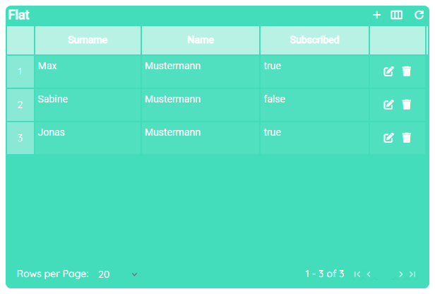
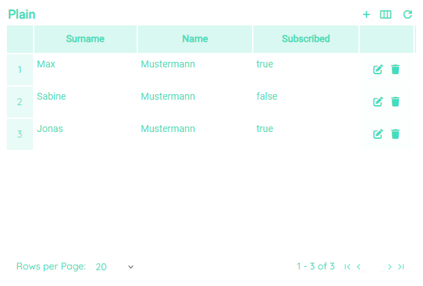
Variations
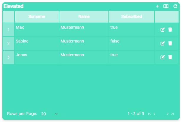
- Elevated
- Flat
- Plain
Blank
- Blank
Scroll-Behavior
For purposes of loading a certain amount of data, one needs to think about a balance between performance and usability. A huge amount of data can take time to fetch and to render.
Therefore we offer a possibility to address these problems and find a solution.
For this, you simply need to modify body-cell__render-type to one of the following three options:
Basic
This causes the data to be loaded at once. Applicable for small amounts of data.Infinite
Initialy, only the visible data entries are rendered, whilst other entries only get loaded and rendered additionally once the user is scrolling.Virtual
During rapid scrolling, virtual scrolling is employed internally, accompanied by a simplified scroll animation. Actual data retrieval and rendering occur only during slower scrolling, ensuring that data is loaded only when the user can effectively engage with it.
Interactive Filtering
In combination with the integrated SourceLink system, you can build an automatic and interactive filtering.
For instance you could filter the table based on a selection inside another yTable.
How to:
- Change the module to Data.
- Create two entities with names "Order" and "Customer".
- Inside the "Order" entity, create a number property: "customerId".
- Inside the "Customer" entity, create two string properties with the names "surname" and "name".
- Change the module to UI-Designer.
- Create two yTable components in your application and connect each one to the entities you have created before.
- Select the created yTable which is connected to the "Order" table and proceed to the Links section within the Detail Panel.
- Create a SourceLink on the other yTable on the
select-rowevent and select_idas theData-Property. - Insert the following string into the
template-filter:customerId eq {value}
When both entities contain valid data, the "Order" table gets filtered each time a row in the "Customer" table gets selected, filtering based on the "customerId", showing only the orders the selected customer did.
Toggle User Actions
- Header actions
Actions that are related to the table as a whole. This means that these actions affect the table itself. - Row actions
These actions apply to single rows.
- Header
- Row
Pagination
For instance, the pagination is a complex construct for defining how many data entries are loaded per view, without the the necessity to change the table page.
For this purpose the table includes mechanisms to control this usecase.
How to:
- Creating new pagination options
- Open the Detail Panel and navigate to the Style tab to unfold TableFooter.
- Now create a new entry for
rows-per-page-optionsand setvalueandlabelto75.
- Setting an initial value:
- In the Detail Panel, navigate to the Style tab and open the TableFooter section.
- Set the
rows-per-pageto75.
Selection styling
There are two different approaches of styling a selection inside the table, which can also be combined.
- Row
- Cell
- Row
- Cell
Changing Display Types
The purpose of this feature presents it's necessity in displaying values of data entries in different variations.
While this might sound confusing for entries like e.g. names or numbers, in fact it is pretty useful for things like boolean values or images. For instance, having an image url which holds a profile picture of every user of your guestlist might require rendering this image as a real image and not displaying the url of it.
Therefore you can change Columns > Generic > display table on the one hand and Columns > Generic > display edit dialog on the other hand.
When changing the display of a column, you always need to select one and make sure the changes you made apply for the data which is stored.
E.g. while displaying a string true as a checkbox might work, displaying a url in the same way does not make sense at all.
Individual Columns
In comparison to changing styles which apply to all cells, you can individualize each column to appear in a unique style.
This also includes the previous example Display of Cells and holds much more possibilities like changing sizing or coloration of special columns.
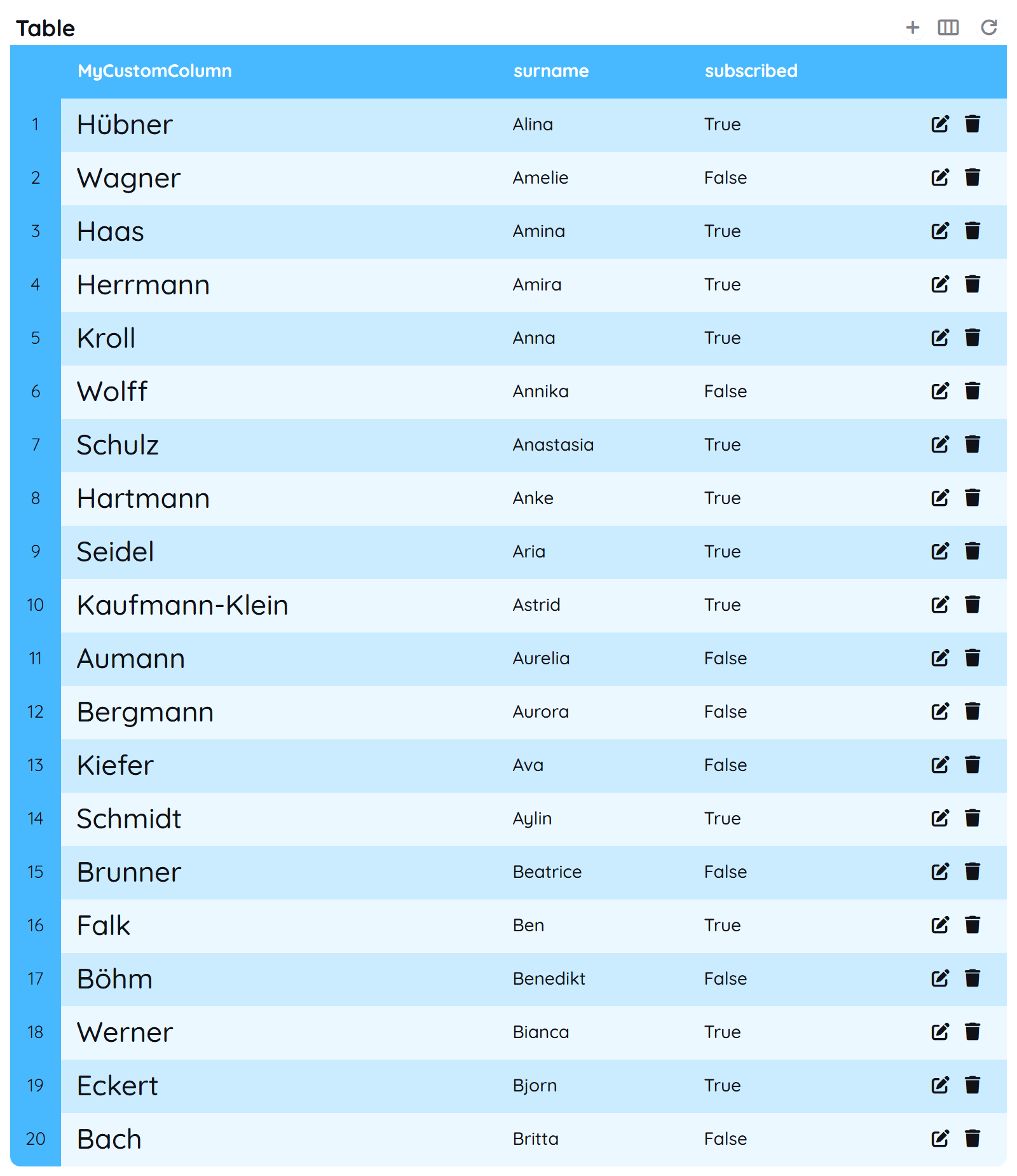
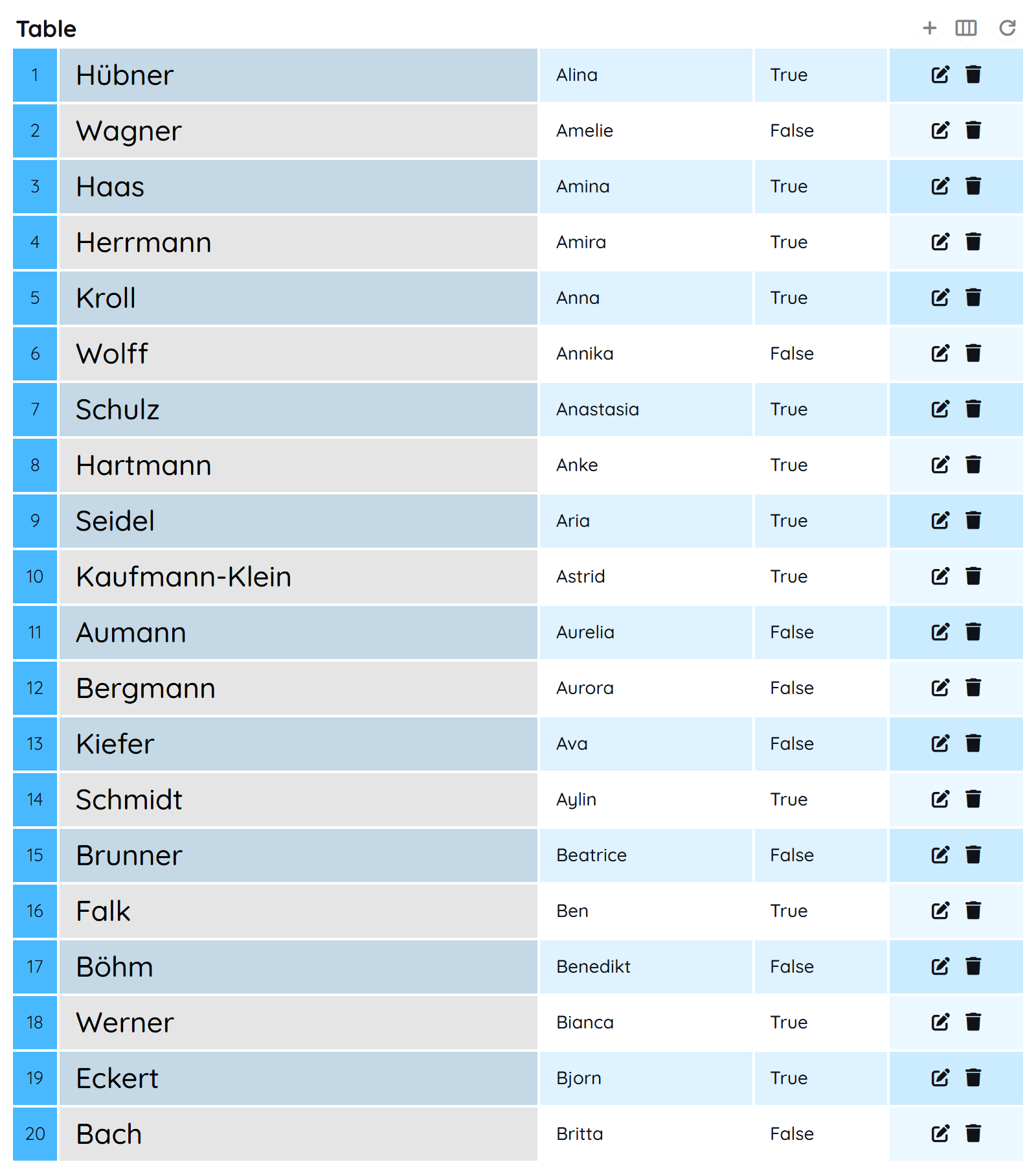
- Sizing
- Coloration
Sorting data
The yTable component enables you to sort the data displayed by each column.
For instance, one could wish to sort ColumnA and ColumnB descending when clicking on ColumnA.
How to:
- Open the Detail Panel and proceed to Columns.
- Select the column you want to assign the sort fiter to.
- Unfold Generic and update the
sort.
The sort filter needs to follow a defined structure to be capable of sorting as wished. For instance the string must contain the column selected. So when editing ColumnA, the sort filter needs to include this column.
When editing ColumnA, following rules need to be followed:
ColumnA descColumnB, ColumnA desc, ColumnC ascColumnB desc, ColumnA desc, ColumnC ascColumnA none, ColumnB desc, ColumnC asc
ColumnB asc,ColumnA,ColumnA asc Column B descdesc